
 By
By 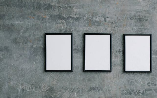
There’s a reason the triptych has been a favourite for so long. Three is a number that just works. If you’ve been sitting on a wall that feels unfinished, this might be exactly the layout it needs. And the format that does it best right now? Three square frames, hung with purpose.
The beauty of the square format is that it brings an inherent evenness to a display. Unlike portrait or landscape frames, which pull the eye in a particular direction, square frames hold their ground equally on all sides. Three of them together create a horizontal line that feels contemporary, whether you’re working with a long stretch of hallway wall or the space above a console table in your living room.
If you’re not sure where to start, take a look at these square photo frames for inspiration.
Three’s Company: Finding Your Prints
The triptych format is forgiving, and the freedom that comes with limiting your choices to just three frames leaves room for a lot of creativity. The most cohesive displays tend to follow one of two approaches: a connected series, or a deliberately varied set held together by a shared colour palette.
A connected series might look like three photographs taken on the same day, a set of botanical prints by the same illustrator, or abstract works that share a common colour. The eye naturally moves across them and reads the composition as a single statement.
The varied approach takes a little more thought to find pieces that work together, but can feel even more personal. Here, the connection is colour rather than content. A dusty terracotta print, a warm cream abstract, and a faded rust photograph might have nothing to do with each other narratively, but hang them in matching square frames and you’ve got a considered aesthetic.
Leave a Little Room
This is where many otherwise lovely displays fall apart. Too much space between frames and the trio loses its harmony, reading as three separate pieces rather than one unified arrangement. Too little and it starts to feel cramped.
A gap of three to five centimetres between each frame tends to hit the right note for square formats. It’s close enough to feel connected, with enough breathing room between for each piece to stand out. Before you put a single nail in the wall, lay your frames on the floor to test the arrangement. Step back and look at the composition before you commit.
The Height Question Answered
Eye level is the standard rule for hanging art, and it’s a good one, but it’s worth thinking about what your triptych is anchoring. If it’s sitting above a piece of furniture, the bottom edge of your frames should be roughly 15 to 20 centimetres above the surface below. This creates a connection between the art and the furniture without making your composition feel as though it belongs in a different room.
If the triptych is the only thing on the wall, treat the centre of the arrangement as your anchor point and aim to hang it so that it sits at approximately eye level for someone standing in the room. 57 to 60 centimetres from the ground is what most would consider eye level, and is the measurement used by museums and galleries. Remember, you know your home best, so don’t be afraid to go for a different height if you feel it will better suit your space.
Frame Finish Matters More Than You Think
The finish on your square frames sets the atmosphere for the whole display. Black frames are the most versatile and work across almost every interior palette, from matt and minimal to glossy, rich and maximalist. They sharpen the edges, giving the whole arrangement a confident, contemporary feel.
Natural wood tones bring warmth and work well in cosy homes that lean into texture, earthy palettes, and organic materials. White or off-white frames keep things airy and sit beautifully in light-filled rooms with a Scandinavian or coastal influence.
Whatever finish you choose, consistency is most important here. Matching frames across all three pieces is what turns three individual pieces into a true triptych. The key is that they read as one piece of art.
Your Style Guide to Triptychs
The triptych format adapts well to most rooms, but it really shines in a few specific areas. A hallway with a long, blank wall is an obvious starting point. So is the space above a bed, where a horizontal arrangement of three square frames creates a headboard-like structure that feels decorative and grounding.
Living rooms benefit enormously from a well-placed triptych above a sofa or fireplace, and dining rooms, often neglected when it comes to wall art, can be transformed by a set of three square frames hung at the right height above a sideboard.
Not sure where to begin? Start small. Pick one wall, choose your frame size, and find three pieces that share something — a colour, a mood, a moment. The triptych format is more forgiving than it looks.















Comments